业界 作者:SegmentFault 2022-07-26 13:03:38 阅读:881
今天小编为大家带来的是社区作者 chokcoco 的文章,在这篇文章他介绍了一种使用滤镜去构建圆角的独特方式。
让我们一起来学习吧~
本文,将另辟蹊径,介绍一种使用滤镜去构建圆角的独特方式。
首先,我们来看这样一个图形:

一个矩形,没什么特别的,代码如下:
div {
    width: 200px;
    height: 40px;
    background-color: #000;
}
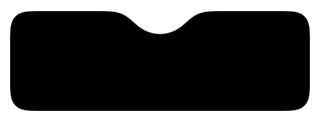
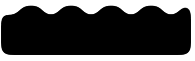
如果,我们现在需要给这个矩形的两端加上圆角,像是这样,该怎么做呢:

So easy,不过就是加个 border-radius 而已:
div {
    width: 200px;
    height: 40px;
  + border-radius: 40px;
    background-color: #000;
}
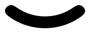
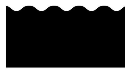
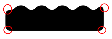
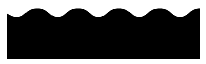
好,那如果,不再是直线,而是一条曲线,希望曲线两端,带有圆角,像是这样,又该怎么办呢:

到这,基本上触及了传统 CSS 的天花板,想通过一个属性搞定这个效果是不太可能了。
当然,有这样一种方式,通过首尾两端,利用两个伪元素,实现两个圆形,叠加上去:

emm,这也是一个可行的方案,主要是定位会稍微有点点麻烦。那么除了这个方式以及直接使用 SVG 外,还有没有其他方法能够实现带圆角的曲线?
有!在 CSS 中,我们还可以通过 filter: contrast() 配合 filter: blur() 这对组合来实现这个图形。
在 神奇的滤镜!巧妙实现内凹的平滑圆角 一文中,其实已经介绍过这个组合的另类用法。
经常阅读我的文章的小伙伴,对 filter: contrast() 配合 filter: blur() 的组合一定不陌生,上经典的一张图:

单独将两个滤镜拿出来,它们的作用分别是:
filter: blur():给图像设置高斯模糊效果。
filter: contrast():调整图像的对比度。
<div class="g-container">
    <div class="g-content">
        <div class="g-filter"></div>
    </div>
</div>
.g-container {
     position: relative;
     width: 300px;
     height: 100px;

     .g-content {
         height: 100px;

         .g-filter {
             height: 100px;
             background: radial-gradient(circle at 50% -10px, transparent 0, transparent 39px, #000 40px, #000);
        }
    }
}

.g-container {
    position: relative;
    width: 300px;
    height: 100px;

    .g-content {
        height: 100px;
        filter: contrast(20);
        background-color: white;
        overflow: hidden;

        .g-filter {
            filter: blur(10px);
            height: 100px;
            background: radial-gradient(circle at 50% -10px, transparent 0, transparent 29px, #000 40px, #000);
        }
    }
}

地址:
https://codepen.io/Chokcoco/pen/JjroBPo
div {
position: relative;
width: 250px;
height: 250px;
filter: contrast(20);
background-color: #fff;
overflow: hidden;
}
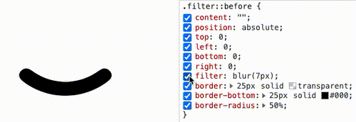
div::before {
content: "";
position: absolute;
top: 0;
left: 0;
bottom: 0;
right: 0;
filter: blur(7px);
border: 25px solid transparent;
border-bottom: 25px solid #000;
border-radius: 50%;
}

div {
    position: relative;
    width: 400px;
    height: 160px;
    background: linear-gradient(90deg, #945700 0%, #f49714 100%);

    &::before,
    &::after {
        content: "";
        position: absolute;
        top: 0;
        right: 0;
        bottom :0;
    }
    &::before {
        width: 10px;
        background-image: radial-gradient(circle at -5px 10px, transparent 12px, #fff 13px, #fff 0px);
        background-size: 20px 20px;
        background-position: 0 15px;
    }
    &::after {
        width: 15px;
        background-image: radial-gradient(circle at 15px 10px, #fff 12px, transparent 13px, transparent 0px);
        background-size: 20px 40px;
        background-position: 0 15px;
    }
}
div {
    background: radial-gradient(circle at 20px 0, transparent, transparent 20px, #000 21px, #000 40px);
    background-size: 80px 100%;
}
<div class="g-container">
    <div class="g-inner"></div>
</div>
.g-container {
    position: relative;
    margin: auto;
    height: 200px;
    padding-top: 100px;
    filter: contrast(20);
    background-color: #fff;
    overflow: hidden;
}

.g-inner {
    position: relative;
    height: 200px;
    background: radial-gradient(circle at 20px 0, transparent, transparent 20px, #000 21px, #000 40px);
    background-size: 80px 100%;
    filter: blur(10px)
}
.g-container {
    position: relative;
    width: 380px;
    padding-top: 100px;
    filter: contrast(20);
    background-color: #fff;
    overflow: hidden;

    &::before {
        content: "";
        position: absolute;
        top: 0;
        left: 0;
        bottom: 0;
        right: 0;
        backdrop-filter: blur(10px);
        z-index: 1;
    }
}
.g-inner {
    position: relative;
    width: 380px;
    height: 100px;
    background: radial-gradient(circle at 20px 0, transparent, transparent 20px, #000 21px, #000 40px);
    background-size: 80px 100%;
}
.g-inner {
    position: relative;
  - width: 380px;
  + width: 480px;
    height: 100px;
    background: radial-gradient(circle at 20px 0, transparent, transparent 20px, #000 21px, #000 40px);
    background-size: 80px 100%;
  + animation: move 1s infinite linear;
}

@keyframes move {
    100% {
        transform: translate(-80px, 0);
    }
}
地址:
https://codepen.io/Chokcoco/pen/PoRzeav

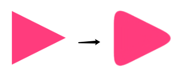
<div class="g-triangle"></div>
<svg width="0">
    <filter id="blur" color-interpolation-filters="sRGB">
      <feGaussianBlur stdDeviation="10" />
      <feComponentTransfer>
          <feFuncA type="table" tableValues="0 0 10"/>
      </feComponentTransfer>
    </filter>
</svg>
div {
        border: 60px solid transparent;
        border-left: 120px solid #f48;
        filter: url(#blur);
}

div {
        border: 60px solid transparent;
        border-left: 120px solid #f48;
        filter: url("data:image/svg+xml,%3Csvg xmlns='http://www.w3.org/2000/svg'%3E%3Cfilter id='blur' color-interpolation-filters='sRGB'%3E%3CfeGaussianBlur stdDeviation='10'/%3E%3CfeComponentTransfer%3E%3CfeFuncA type='table' tableValues='0 0 10'/%3E%3C/feComponentTransfer%3E%3C/filter%3E%3C/svg%3E#blur");
}
https://codepen.io/Chokcoco/pen/QWmEXPY
使用了 filter: contrast() 之后,图形的尺寸可能相对而言会缩小一点点,要达到固定所需尺寸的话,要一定的调试
此方式产生的图形,毕竟经过了一次 filter: blur(),放大来看图形会有一定的锯齿,可以通过调整 contrast 和 blur 的大小尽可能的去除,但是没法完全去掉
SegmentFault 思否社区小编说
自 2022-07-01 起 SegmentFault 思否公众号改版啦!之后将陆续推出新的栏目和大家见面!(请拭目以待呀~❤)
在「社区精选」栏目中,我们将为广大开发者推荐来自 SegmentFault 思否开发者社区的优质技术文章,这些文章全部出自社区中充满智慧的技术创作者哦!
希望通过这一栏目,大家可以共同学习技术干货,GET 新技能和各种花式技术小 Tips。
欢迎越来越多的开发者加入创作者的行列,我们将持续甄选出社区中优质的内容推介给更多人,让闪闪发光的技术创作者们走到聚光灯下,被更多人认识。
「社区精选」投稿邮箱:pr@segmentfault.com
投稿请附上社区文章地址


Copyright © 2015 KnowSafe All rights reserved.
公司地址:成都市高新区天府大道北段1700号
业务邮箱:Sales@knowsafe.com