业界 作者:SegmentFault 2021-11-27 14:59:01 阅读:1152
作者:XboxYan
简介:偏用户体验的前端
来源:SegmentFault 思否社区


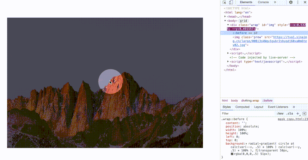
<div class="wrap" id="img">
    <img class="prew" src="https://tva1.sinaimg.cn/large/008i3skNgy1gubr2sbyqdj60xa0m6tey02.jpg">
</div>
.wrap::before{
content:'';
position: absolute;
width: 100px;
height: 100px;
border-radius: 50%;
left: 50%;
top: 50%;
transform: translate(-50%,-50%); /*默认居中*/
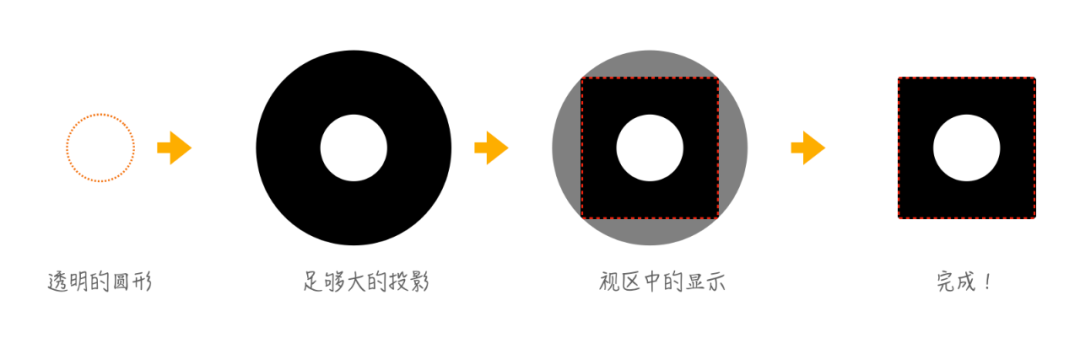
box-shadow: 0 0 0 999vw rgba(0, 0, 0, .5); /*足够大的投影*/
}
img.addEventListener('mousemove', (ev) => {
    img.style.left = '...';
    img.style.top = '...';
})
.wrap::before{
  left: calc(var(--x) * 100%);
  top: calc(var(--y) * 100%);
}
img.addEventListener('mousemove', (ev) => {
    img.style.setProperty('--x', ev.offsetX / ev.target.offsetWidth);
    img.style.setProperty('--y', ev.offsetY / ev.target.offsetHeight);
})

.wrap::before{
    content: '';
    position: absolute;
    width: 100%;
    height: 100%;
    left: 0;
    top: 0;
    background: radial-gradient( circle at center, transparent 50px, rgba(0,0,0,.5) 51px);
}
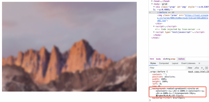
.wrap::before{
  background: radial-gradient( circle at calc(var(--x) * 100% )  calc(var(--y) * 100% ), transparent 50px, rgba(0,0,0,.5) 51px);
}
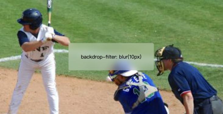
backdrop-filter: blur(10px);
.wrap::before{
  content:'';
  position: absolute;
  width: 100px;
  height: 100px;
  border-radius: 50%;
  left: 50%;
  top: 50%;
  transform: translate(-50%,-50%); /*默认居中*/
  box-shadow: 0 0 0 999vw rgba(0, 0, 0, .5); /*足够大的投影*/
  backdrop-filter: blur(5px)
}
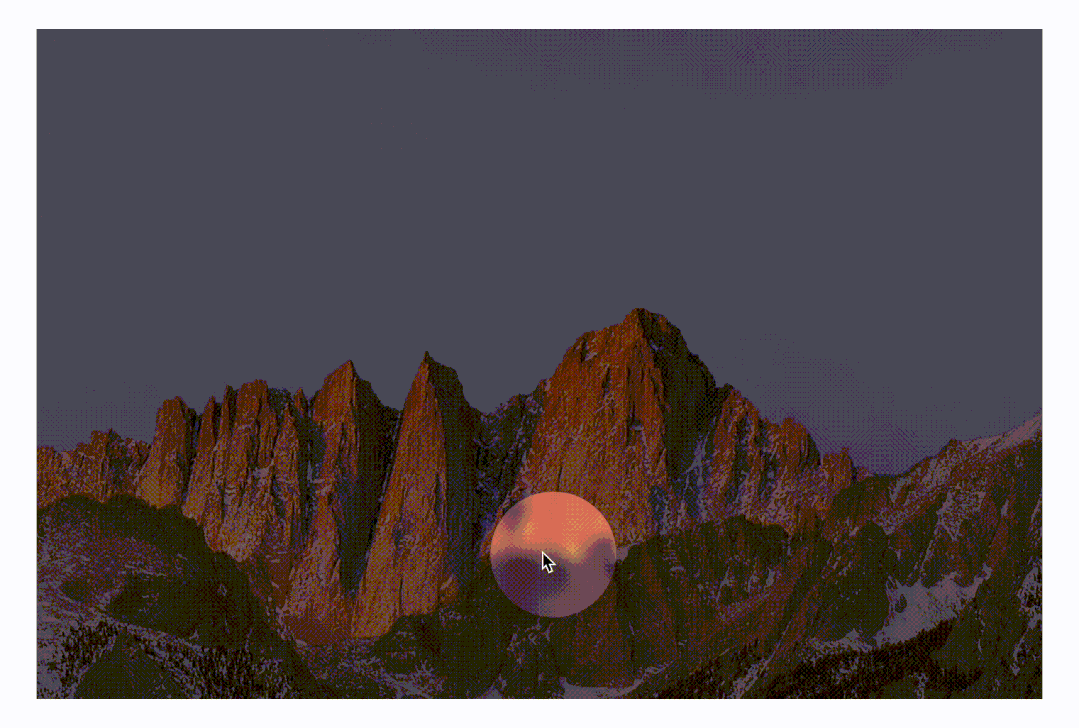
.wrap::before{
    content: '';
    position: absolute;
    width: 100%;
    height: 100%;
    left: 0;
    top: 0;
    background: radial-gradient( circle at calc(var(--x) * 100% )  calc(var(--y) * 100% ), transparent 50px, rgba(0,0,0,.5) 51px);
      backdrop-filter: blur(5px)
}`

.wrap::before{
    content: '';
    position: absolute;
    width: 100%;
    height: 100%;
    left: 0;
    top: 0;
    -webkit-mask: radial-gradient( circle at calc(var(--x, .5) * 100% )  calc(var(--y, .5) * 100% ), transparent 50px, #000 51px);
      background: rgba(0,0,0,.3);
      backdrop-filter: blur(5px)
}
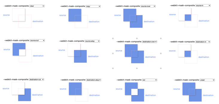
/* Keyword values */
mask-composite: add; /* 叠加(默认) */
mask-composite: subtract; /* 减去,排除掉上层的区域 */
mask-composite: intersect; /* 相交,只显示重合的地方 */
mask-composite: exclude; /* 排除,只显示不重合的地方 */
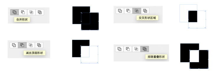
-webkit-mask-composite: clear; /*清除,不显示任何遮罩*/
-webkit-mask-composite: copy; /*只显示上方遮罩,不显示下方遮罩*/
-webkit-mask-composite: source-over;
-webkit-mask-composite: source-in; /*只显示重合的地方*/
-webkit-mask-composite: source-out; /*只显示上方遮罩,重合的地方不显示*/
-webkit-mask-composite: source-atop;
-webkit-mask-composite: destination-over;
-webkit-mask-composite: destination-in; /*只显示重合的地方*/
-webkit-mask-composite: destination-out;/*只显示下方遮罩,重合的地方不显示*/
-webkit-mask-composite: destination-atop;
-webkit-mask-composite: xor; /*只显示不重合的地方*/
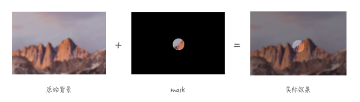
.wrap::before{
    content: '';
    position: absolute;
    width: 100%;
    height: 100%;
    left: 0;
    top: 0;
    -webkit-mask: url("data:image/svg+xml,%3Csvg width='50' height='50' viewBox='0 0 50 50' fill='none' xmlns='http://www.w3.org/2000/svg'%3E%3Ccircle cx='25' cy='25' r='25' fill='%23C4C4C4'/%3E%3C/svg%3E"), linear-gradient(red, red);
      -webkit-mask-size: 50px, 100%;
      -webkit-mask-repeat: no-repeat;
      -webkit-mask-position: calc(var(--x, .5) * 100% + var(--x, .5) * 100px - 50px )  calc(var(--y, .5) * 100% + var(--y, .5) * 100px - 50px ), 0;
      -webkit-mask-composite: xor;   /*只显示不重合的地方, chorem 、safari 支持*/
      mask-composite: exclude; /* 排除,只显示不重合的地方, firefox 支持 */
      background: rgba(0,0,0,.3);
      backdrop-filter: blur(5px)
}

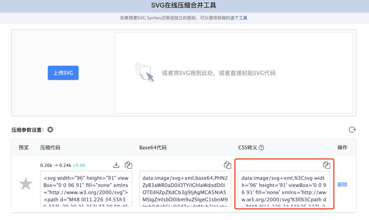
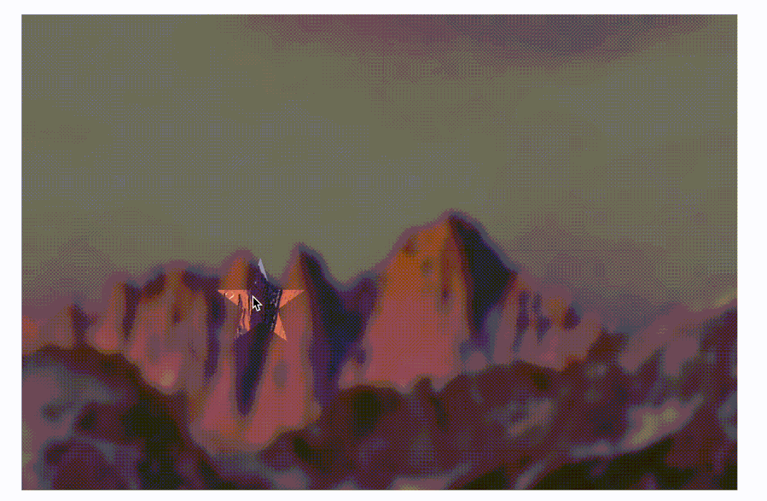
.wrap::before{
    content: '';
    position: absolute;
    width: 100%;
    height: 100%;
    left: 0;
    top: 0;
    -webkit-mask: url("data:image/svg+xml,%3Csvg width='96' height='91' viewBox='0 0 96 91' fill='none' xmlns='http://www.w3.org/2000/svg'%3E%3Cpath d='M48 0l11.226 34.55h36.327l-29.39 21.352L77.39 90.45 48 69.098 18.61 90.451 29.837 55.9.447 34.55h36.327L48 0z' fill='%23C4C4C4'/%3E%3C/svg%3E"), linear-gradient(red, red);
      -webkit-mask-size: 50px, 100%;
      -webkit-mask-repeat: no-repeat;
      -webkit-mask-position: calc(var(--x, .5) * 100% + var(--x, .5) * 100px - 50px )  calc(var(--y, .5) * 100% + var(--y, .5) * 100px - 50px ), 0;
      -webkit-mask-composite: xor;   /*只显示不重合的地方, chorem 、safari 支持*/
      mask-composite: exclude; /* 排除,只显示不重合的地方, firefox 支持 */
      background: rgba(0,0,0,.3);
      backdrop-filter: blur(5px)
}


Copyright © 2015 KnowSafe All rights reserved.
公司地址:成都市高新区天府大道北段1700号
业务邮箱:Sales@knowsafe.com